Monosemikodachrome text

Monosemikodachrome text

Wednesday, April 30, 2014

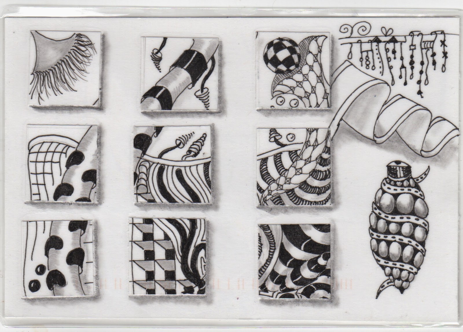
Tiled zentangle in black and white- Prairie Kitten

Fabulous to see how Prairie kitten manages to capture light in her intricate and unusual zentangle.  Pairie Kitten has cut what must have been a square zentangle and collaged it onto a card, added some more illustrations and then laminated it.  I can see sounds.  Perhaps someone could play this graphic score?

The music and colour of birds - Edna Toffoli


 I am enchanted by the way Edna has used colour to make these birds seen and heard! What a joyful piece that I am delighted to include in the MSK exhibit!
 I hope Edna intended me to invite you all to her mail art call.  I will be sending something soon.

Dazzling Digital collages from Alexander Limarev - Russia


When I  show these pieces I think I might ask the musicians to 'sing' some of the images.  I would very much like to HEAR these images!  Thank you Alexander!

Tuesday, April 29, 2014

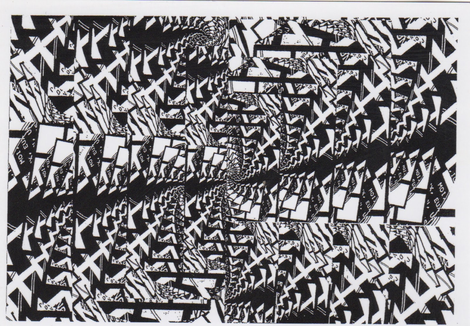
Giant slide cultures from Dan Moeur!


Dan's intentional piece for MSK came with a gush of other entries.  Dan's is the interesting tubular entry.  Dan asked if it had arrived a few days ago and I had to admit that it was in the blogging queue.  If Vizma had a camera into everyone's studios she would see a physical queue stretching across surfaces in mine. 

I'm usually prompt in my blogging but LIFE got in the way again and I am behind.  I scanned Dan's print as soon as I got it out of the tube - the tube was a made tube and I could see it was also a print…
I tried to scan it but it was too big (more than A3 size.  Also it was curling, so I put it under some stuff and waited.
I'm sure you will agree that it has been worth the wait.  Dan has enlarged a microscopic world, of the mind… the mark making is beautiful.  I know Dan uses both physical prints and digital practices when he works.  I wonder if he began with a gelatin plate? Is it a series of mono prints?  Is he working back into ghosts?  The whole effect feels like a giant strip of film which is perfect. And then I remember learning to make a malaria slide and wonder whether the microscope image would look a little like this?


When I took the tube to pieces I found this print which I suspect is another piece for MSK.  Many thanks Dan.  Tell us how you did it all, really!

Monday, April 28, 2014

My colours from Susan McAllister


This print 5 x 6 inches (which for me sounds/feels like the water on a summer day) is not haptic to touch, but is textured and just about my favourite mix of colours!  Thank you Susan. I want to dive into it!

DK's upcycled film arrives home


Gorgeousness! 

Raw materials from me in the UK, upcycled in Elgin, America. I think DK intends it this way up, although I love the way the creature walks when it is the other way around! 

Folded Framed Film - from Petropetal


 This very cool piece arrived in the shape of an envelope.  It was stapled and I wasn't sure if I was meant to open it.  I could tell it was for MSK.  Isn't film great? I waited.  I scanned the front and back  then I tugged.
Hiding in the fold is a swimmer pulling his or her way through the waves. Here it upside down. 

I thought of the inside as an altar, a folded picture frame, something that a lover would look at to conjure up the missing partner.  Two postives (a man and woman) are sandwiched together over a mandala.  The effect is beautiful, ornate. It gives me ideas of things to do with kids in schools too.  And I thought, 'that's great, what a fun and effective piece for MSK.'  But there was this staple and I couldn't help wondering… so I tugged and what was revealed was the word, 'AXIOPISTY: the quality that makes something believable.' What a perfect word.  Say it out loud. Petropetal had made me believe in her mail art three times,in three incarnations.  This piece definitely has AXIOPISTY!

and this is what the postives look like on their own.  


I am sticking a piece of velcro on the folding picture frame because I love the piece in that form but at the MSK show I will encourage visitors to prise it apart and investigate other guises.

Saturday, April 26, 2014

From Clemente Padin, Uruguay!


De Bussy 1862-1918 - From REALNEO


Some San Francisco color for the UK - Tofu

I have seen a few characters made by Tofu in this style, and while they are exqusitie,  this is most definitely the finest TOFU mail art I have seen in the series, and it's mine! Some art has the fingerprints of the artist in it.  This clearly took lots of time but somehow Tofu manages to make it feel effortless, joyful. As Diane Keys said about something once, 'I could eat it.' But, of course I won't - instead I will admire it often and relish finding a central spot for it latterly. My scan is a bit blurry, so I will add a photograph soon, but I wanted to share this ASAP.  I adore it. 

As some of you know I used to live on the West Coast and I can still remember my first visit to San Francisco in 1978.  I hadn't been to Singapore or New Orleans yet and I remember being bowled over  by the colours of the architecture.  TOFU has captured this.  This piece just oozes West Coast light and will brighten up the MSK show enormously!

Just wow.

Thursday, April 17, 2014

Monochromatic exquisite simplicity from some guy named Keith


Great details, never thought before that a moustache is upturned eyebrows! Even the stamp echoes the images. Keith says on his IUOMA page something about mail art and stories..there is certainly a story here! I love people who can say more with less and this is masterful.

Sunday, April 13, 2014

Monochrome dance map - Klaus Pinter


I believe I got a version of this for my previous mail art call.  It's fabulous to get something and interpret it differently because of the context.

Trashpop from FakeFine Art


It looks as if this piece has been in transit for quite some time ( see a mid March postmark).  Nevermind.  I am as delighted to have my own TRASHPOP now as I would have been if it had arrived with alacrity.  Although I feel as if this aludes to the crushed and spent aspect of pop art, I think Fake Fine Art has pulled off something glorious, and lasting here.  That banana makes me uncomfortable, don't ya think?

Thursday, April 10, 2014

Author Pauline Manders is thanking me in colour

Not everyone has neighbours like we do, our next-door neighbours are fab.  Pauline is the author of a series of books and I make her covers, and her book marks and her badges and last week when we went over for supper I made her a little Utterly tote bag.  I forgot to send her a thank you piece of mail art for the dinner, but she didn't forget me!

Pauline is a supporter of mail art, although she doesn't make it herself.  So I was touched when she found this wooden postcard (that meets the brief for this mail art call) and sent it my way.
Thank you Pauline!

Eni Ilis is playing with colour!

 Eni sent me this wrapped blue cellophane postcard.  You will see below that I also received an egg bookmark.  Love that repetition of form! The surprises of fishing for an egg and an egg made of painted grass are delightful. The fisherwoman certainly looks intent.
 The way Eni has created green with the yellow and blue and a darker blue with folds and has left the word 'yellow' in the tiles must be intentional.  


 The envelope is made from a brochure page.  Great stuff!  Thanks you for all the colour!

Monday, April 7, 2014

A Sextet of Monochrome Vispo from Christian Burgaud (France)


Delighted with these striking images from a new contributor! First four are A4 prints and the 5th is a postcard.  Thank you Christian for these musically mathematical pieces.

Greenfield and A1 Waste Paper Kodachrome collab

Checkout all the great stamps and stickers on this envelope from Michael Leigh (and it's recycled)! 

Inside I found a short stack of editions of a collab between Mark Greenfield (mostly, apparently) and Michael Leigh.  I am tempted to ask my audience to create a caption, so much going on it's hard to know where to begin.  The image has a vintage poster feel that is great!  Keep your eyes peeled.  I will be distributing them in the near future.


 In addition to the A4 image, I have a few fluxus bucks ready to share too! 
 You may also recognise some of these characters too! 
 Many thanks A1.  I will weigh my letters with care (to avoid higher postal fees)and sneak a few of these into envelopes of deserving networkers!


Thursday, April 3, 2014

An technicolour envelope full of stickers from The Sticker Dude


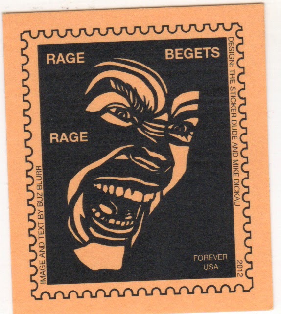
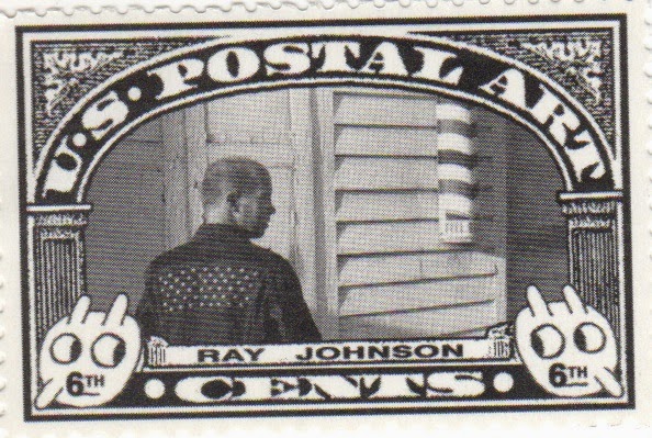
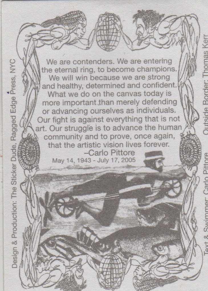
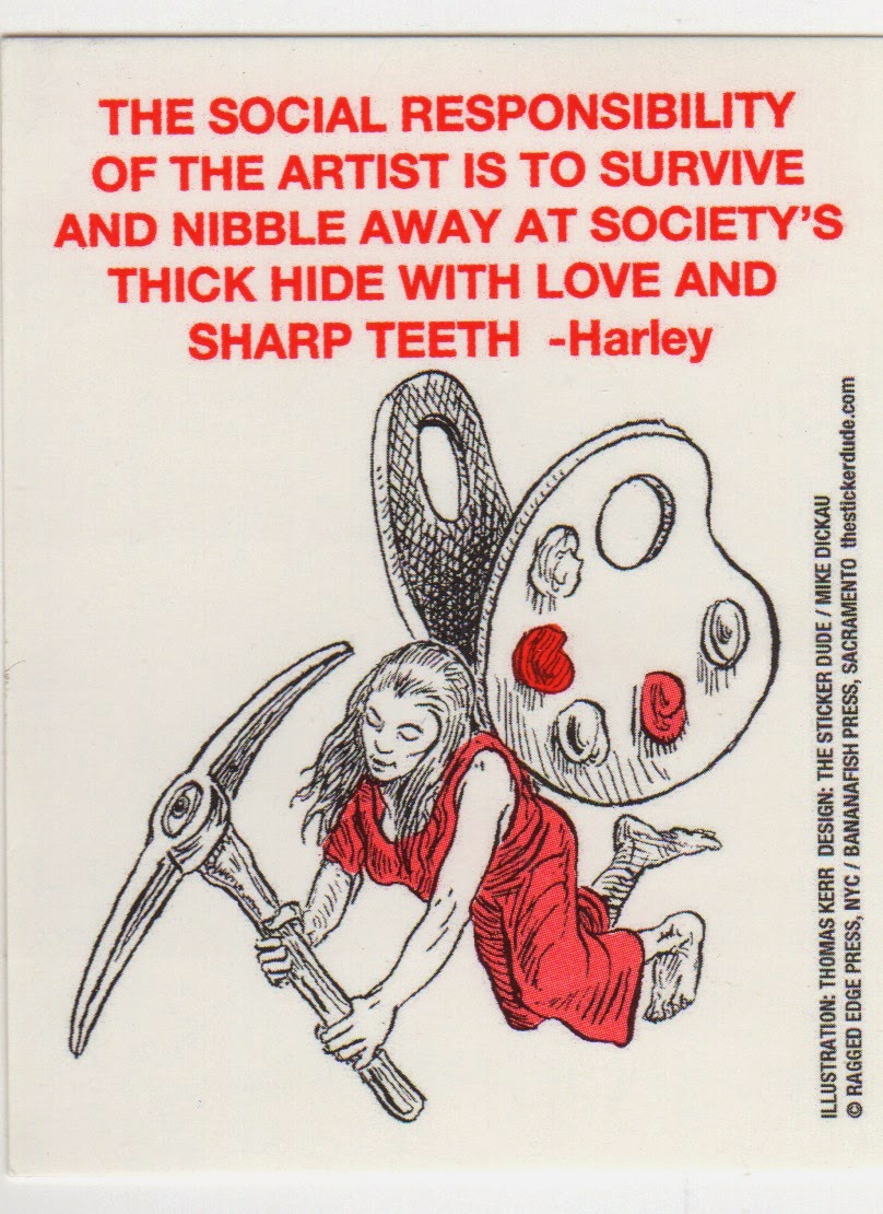
What a fun fantasy of stickers and stamps! Beautifully kodachrome with a good dose of semitone and monochrome thrown in! Love the quotes.  Many thanks.